Product Design
2 weeks
End-to-end Designer
Claude Code
The App in Action
Scroll the image to preview
The Process
Alarms need to be manually set and are stressful to constantly hear.
Small notifications are easy to overlook.
People are overloaded with meetings and can accidentally miss one.
Urgency is a tedious manual setting for alarms. They do not automatically adapt.
The Goal
To create an app that can automatically connect to my calendar and send me notifications that I can't ignore, all without the unnecessary stress.
Calendar and Settings
Simplified workflow
1
Research
2
Plan
3
4
Research
Where I Looked
When I was younger, I watched the TV show "Heroes" feature a deaf character waking up to a soundless alarm. That memory led me to draw inspiration for the functionality of this app from individuals with hearing impairments or ADHD, resulting in a solution that benefits everyone, the ˝curb-cut effect."
What That Told Me
Both groups benefit from an alert that lives in their visual field. While sounds can be stressful, tuned out, or unheard, a visual cue can be more difficult to miss if utilized properly.
Features To Include In This Alarm
Soundless
Calm visuals
Tiered alarms
Visual Urgency
30-minute warning
1-minute warning
Plan
Communicate
I connected with Claude Code's plan mode and shared everything I researched, wanted, and needed for this app. Using previously uploaded skills, I made sure that Claude understood the basis of what I needed to be achieved visually and functionally.
Learning Curve
This process included the AI and I asking questions back and forth. I learned more about what was needed from me for the vibe-coding process while also making sure that Claude asked me questions when it needed more information, rather than filling in the blanks on its own.
Design/Prototype: Crafting Prompts
First Attempts
Claude Plan helped eliminate a lot of unnecessary back and forth when conceptualizing. The first visuals generated were decent, but needed a lot of revisioning. For example, there was a clear lack of a design system when the first screens were generated.
Design Judgment
Revised prompts required more specification. I revised the generated screens and pointed out issues and inconsistencies with:
Visual Hierarchy
Refining Designs
After reviewing the screens and their functionality, I refined the designs with Claude and moved forward with early user studies. Participants explored the functionality of the app in an HTML generated prototype and inspected the screens. After gathering notes and cycling through the prompting process again I was able to proceed with launching.
Prompting Roadblock
In my prototyping phase, I identified a key problem caused from my prompting that could ruin the usability of my app.
The intensity of bubbles generated at the five- and one-minute intervals was causing significant lag.
To mend this issue, I tweaked the obvious fixes first: quantity, size, and animation.
Every fix targeted the symptom, but none fixed it.
My experience in illustration made the unnecessarily bloated file obvious.
This time, I instructed Claude on how to construct each bubble through refined prompts. The look was similar, the file was much smaller, and the lag was gone.
Different ways Claude tried to "simplify" the bubbles before giving it exact directions
LAUNCHED
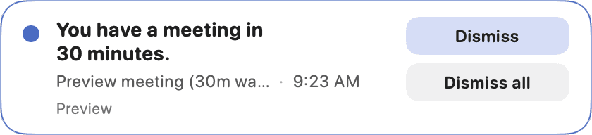
Designed, Built, and Launched


Measuring Success
Key Metrics
Metrics that I would measure after interviewing testers who used Bubble Over.
Missed meeting Rate
Reliance on backup alerts
Time-to-dismiss alerts
Interuption comfort
Onboarding friction
Retention/continued use
Reflection
This was my first vibe-coded project that I launched, and it wasnˇt designed with the traditional product design process. Using AI bypassed some of the typical flow, but there are some things I would consider changing:
1
Pay closer attention to how AI is building the features
Had I been paying closer attention to the AI, I might've been able to catch some issues that appeared later on in the process.
2
Bring wireframes back into the process
AI gave me polished screens fast, but I landed on a solid answer without exploring the alternatives. I never got to ask 'what about a layout like this?'
3
Refine my prompts and planning
I had to refine my prompts and work with Claude to fix issues with the design of the app because I had failed to work with it and build a basic design style guide.
4
Work within the target coding language faster
Refining within HTML and converting into Swift was more of a setback than it was helpful. I spent days fixing what broke in translation.