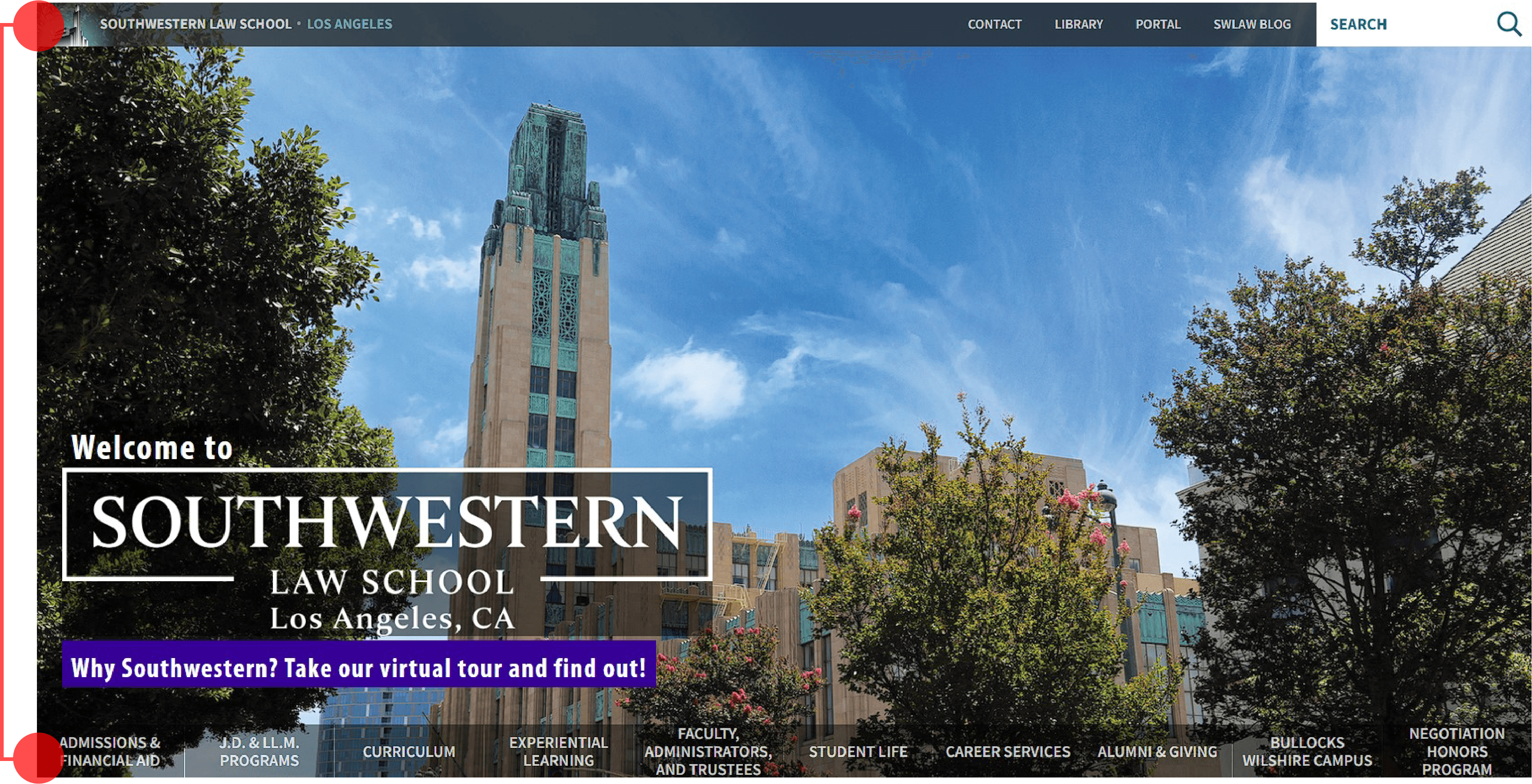
SWLAW Website Redesign

Ordering Made for Food Events

A redesign of the Southwestern Law School Website.

UX

UI

Product Design

AI

Project Overview

Client: Southwestern Law School
Project Type: UX/UI
Industry: Higher Education, Law School
Tools: Figma, ChaptGPT
My Role: Lead UX/UI Designer

"Are you on Yelp?"
"No, I'm on TheGo."


CONTEXT

A Solution That Could Change Experiences For 40 Million+ People


PROBLEM

Food vendors at events don’t have an ordering system.

Concerts, night markets, and pop-ups rely on long physical lines because there’s no digital way to discover vendors or order ahead.

This causes:

  • Long wait times

  • Lost sales for vendors

  • No central place to see who’s selling

72%

of consumers prefer ordering food digitally when the option exists.

UpMenu Food Ordering Behavior Report (2023)

30%

Long lines cause up to 30% revenue loss for vendors at high-traffic events.

Industry analysis via FoodTruckBooking (2024)

My Task

Develop an app focused on traveling food vendors and events that saves time for and creates opportunities for both customers and businesses.


RESEARCH

What's Missing From the Current Market?

From studying the current top food ordering apps and conducting 15 user interviews, I was able to uncover some key insights:

  1. Lack of Accessibility

Long lines and crowded environments prevent many people from ordering at events.

"My wife has had a lot of knee issues lately. We can't bother going to events where we know that we would have to stand for long periods of time."

Enable ordering without standing in line.

The experience should let users browse, choose, and order comfortably from anywhere at the event.

  1. No Stock = A Wasted Trip

Vendors often sell out mid-day, leaving customers disappointed after walking long distances.

"There were a couple of times I tried visiting a food truck, and the item I wanted was already sold out. I just went home saying I'd try again, but never did."

Provide real-time stock visibility.

Users should know what’s available before they come

  1. Lack of Visibility

People often don’t know of nearby vendors or local events.

"I found out on TikTok there's a weekend Thai market around here. I've lived here for 5 years and never knew."

Make vendors and events easy to discover.

The app should surface nearby vendors and event lineups in one place.


Immediate Possible Solutions

Features To Work Towards

72%

of consumers prefer ordering food digitally when the option exists.

UpMenu Food Ordering Behavior Report (2023)

30%

Long lines cause up to 30% revenue loss for vendors at high-traffic events.

Industry analysis via FoodTruckBooking (2024)


Who's Our Target Audience?

User Personas

To expand my design perspective, I created personas from varied backgrounds. One was inspired by my experience as a new uncle observing the changes in my sibling's life. I wanted to highlight the challenges of a young parent managing a child while ordering food.

Storyboarding

Using these personas, I storyboarded typical user journeys. This immediately exposed different pain points, such as:

• Standing in line as an accessibility issue

• Food trucks running out of stock frequently

• Allergy concerns beyond what a basic notes section can handle


DESIGN PROCESS

Prototyping to High-Fidelity Design in Figma


Quick and Revealing, Hand-Drawn Wireframes

Quickly sketching wireframes allowed me to find the direction that I wanted to go with the design fairly quickly. I aimed for four design iterations of each screen that I needed to create, and either chose the best direction or pulled the strongest sections from each sketch and Frankensteined a stronger direction to follow.


Screens to include:

  • Home

  • Food truck Profile

  • Item fill out card

  • Cart & Check out

  • Discover

  • User Profile


DESIGN PROCESS

Multiple Iterations and Testing Phases

Before I began, there wasn't a designer on the team who was versed in Figma. As the sole UX/UI designer, I taught myself the program and continued to iterate and conduct multiple rounds of testing.


Wireframes

Because we were starting with a previous version, we had a general idea of what we wanted on the page. My job was to understand how to iterate upon that and improve. My process started with brainstorming what else could be added to the site. Through our research, we determined things that prospective students would want to see on our website.


Sections to include:

  • Strong Hero image with apply and virtual tour CTA's• Clear navigation bar with current students and future students tabs

  • Appealing stats that make the school stand out

  • All the J.D. programs listed out clearly

  • Newsroom section of relevant events pertaining to the school

  • Meet the Faculty section, highlighting popular faculty members• Featured events for prospective students


My Approach

Sketching out wireframes on paper for the sections allowed me to quickly iterate and imagine how the whole site might come together. From here, I was able to produce digital wireframes to present to my CMO for feedback.


Low-Fidelity Prototype

After producing a low-fidelity prototype and presenting it to the CMO and other stakeholders, I received valuable insights, implemented requested changes, and began designing a High-Fidelity Prototype.


High-Fidelity Prototype Part 1

I quickly noticed some pain points as I worked on the received notes and rendered the designs further. I had to figure out a way to find a balance between the two designs.


Some pain points we ran into were:

  • Cutting down navigation bar of too many tabs left it more confusing

  • Having to click items for more info did not help streamline the process

  • The admissions event section needed multiple events

  • Visually simplifying sections did not improve the user flow


Focus Group Part 2

After iterating more on the prototype, I reached the point where I was ready to receive feedback from our users. This focus group consisted of new students who had not participated in the first one. We received a lot of good insights from these users and I was able to produce a nearly finished design.


High-Fidelity Prototype Part 2

Finally, with all the accumulated data, I was able to go back to my design and address all the faults that were discovered. I decided to approach this final design in a different way, by focusing on a user journey for the prospective students themselves and their journey to apply to the school.


SOLUTION

A Clean Website With A Clear User Journey for Prospective Students

Southwestern Law School has a 3rd party company of engineers that I was able to meet with and discuss the next steps of launching this page. While working on this project, I had to understand the limitations of our capabilities and design within the scope of our budget. As the design for this project is nearing its last stages, we are preparing for the next steps to launch this site before the end of the year. 


IMPACT

A Solution For Businesses And Customers


The original problem was seemingly simple; there are no apps that include all food trucks and their specific business model.

What I ended up uncovering and solving:

  • The most popular apps don't cover every need, such as providing allergy alerts.

  • Most food apps require businesses have a permanent location before using the app.

  • Waiting in long lines at events can be an accessibility issue.

Upon my final user testing, 100% of users successfully completed the checkout process and comfortably navigated the discover section.


KEY TAKEAWAYS

Designing For Humans, Not Just Aesthetics

I was confident in visual storytelling, but product design challenged me to think beyond aesthetics. This project taught me how to design an experience from the ground up, centered on real user needs. It pushed me to combine empathy, research, and design to create something both functional and impactful.


Where I Grew

  • Learned to empathize with users and design more inclusively

  • Practiced real research, testing, and iteration

  • Sharpened my Figma and prototyping skills


What I would improve for the future

  • Focus more on user flow than perfecting early wireframes

  • Distinguish between helpful and distracting feedback

  • Design with accessibility and mobile touch targets in mind


Culminating Thoughts

I’m very proud of my final product. While this was just a solo project, it pushed me to really think beyond myself and understand how differently people think.

User Personas

To expand my design perspective, I created personas from varied backgrounds. One was inspired by my experience as a new uncle observing the changes in my sibling's life. I wanted to highlight the challenges of a young parent managing a child while ordering food.


Storyboarding

Using these personas, I storyboarded typical user journeys. This immediately exposed different pain points, like:

• Standing in line as an accessibility issue

• Food trucks running out of stock frequently

• Allergy concerns beyond what a basic notes section can handle

Want to reach out?

I'd love to connect with you!

©

2025

©

2025

©

2025